
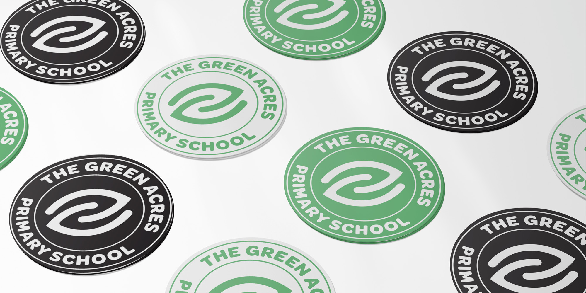

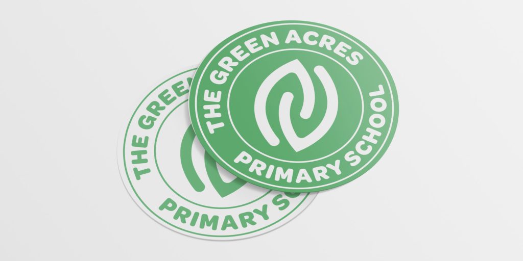
Brief
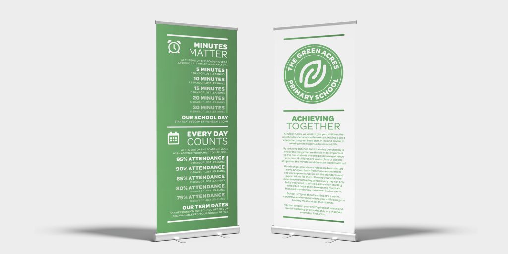
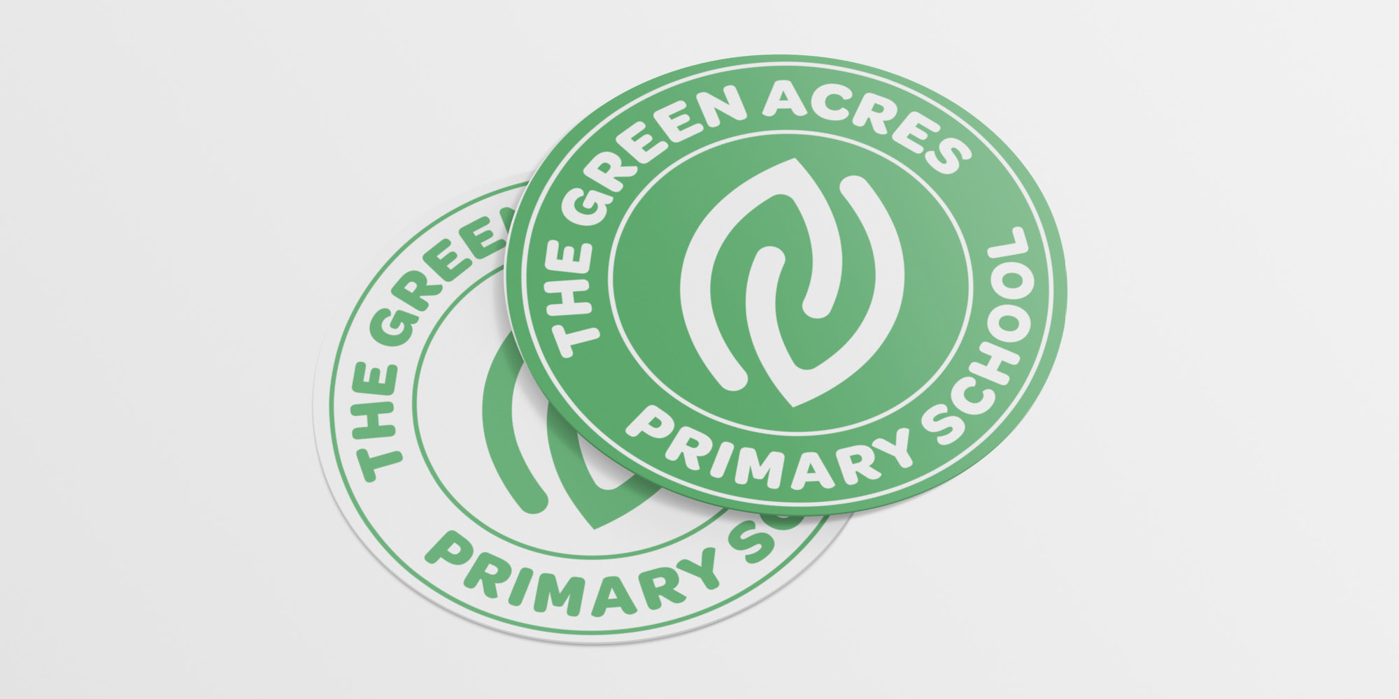
Design a fresh brand identity for The Green Acres primary school. School was keen to use nature as a theme based on their local environment.
Delivery
Design of a new logo, featuring abstract leaves motif, along with natural colours. Included black version to show how the logo looks when photocopied such as on school letters.
Impact
A fresh start for the school, parents commented on the newer logo being an improvement over the ‘fussy’ original.


